Nate Silver: "Go to a state school"
Anonymous
talk about stereotyping. How do you know they got tutoring? Mine didn't. Only took it once, and got a 1580. A 700 mark is not "near perfect scores". |
Anonymous
Oh well if you didn't get tutoring then must be right lol Did you go to an Ivy? If so your post alone demonstrates what a bad education they provide. |
Anonymous
So what is that at 32? A 33? |
Anonymous
I think it is -- top 5% on any given marker seems high enough to meet the threshold of "near perfect" no matter how much people want to quibble about distinctions above that percentile. I just don't think there's a meaningful difference in what matters to being successful in college or life thereafter between someone who gets a 1400 vs a 1500 vs a 1600 and I haven't seen sufficient evidence to the contrary. |
Anonymous
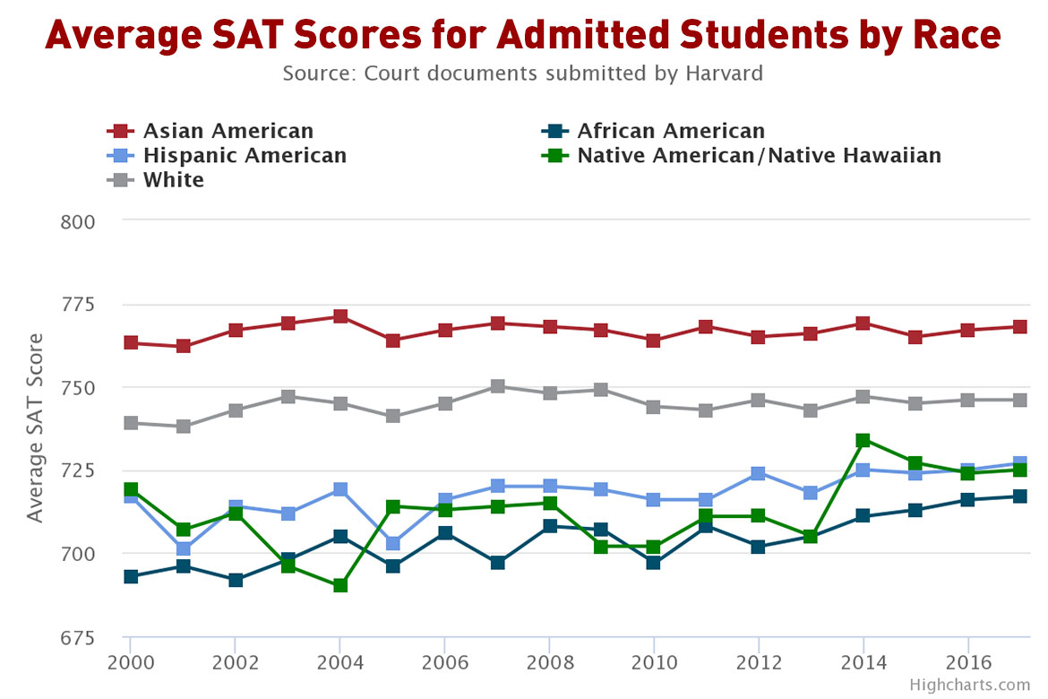
This graph is visually misleading, and you should know that. It’s scaled such that a 675 looks like the lowest, thus making 10-20 point increments look material. We know that isn’t the case. If it were scaled from 200-800 as it should be, the difference would not appear nearly as significant as this graph (and you) would like us to believe. It has literally never, ever been, nor should have been, the case that universities fill up their classes by slotting in all the 1600s, then all the 1590s, then the 1580s etc until they get a full class. It is entirely plausible that 1400 SAT applicant has many desirable traits and talents that a 1580 one doesn’t. |
Anonymous
Let me school you a bit. Go to your chart. Check the X axis. The scale of the chart is designed to make it seem as if there are big differences amongst the scores, but the average score for all races is some form of 700. At Harvard, they taught us (even the minorities) how to discern lies backed by stats and charts. |
Anonymous
And what's unspoken in the article is the exact extent to which the argument applies where a student's only strong public option is out-of-state. |
Anonymous
Also the gap is narrowing over the years and seems to lack data past 2016, although the Harvard discovery has data from recent years. Easier to lie and deceive with chart without including all of the data. |
Anonymous
PP here. I didn’t see this response before I posted, but it corroborates my point about the X axis. |
Anonymous
|
Here’s the problem; in order to have a successful state university you need to be in a major metro location. This affects everything: the talent you bring in, the donors you attract, the ease of bringing in out of state talent, the prominence of your university on the international level. Private universities don’t have to deal with that, because they are state owned. Dartmouth is just as good as ucla; but ucla would not be as good as Dartmouth if it weren’t for the la location.
Actually you can map the best comprehensive state universities ( that is, not just good at stem) by metro location of the top us metro areas. Detroit (Michigan) La ( UCLA) Chicago( Illinois) Seattle ( Washington) San Francisco ( Berkeley) A big exception here is Wisconsin; the state does not really have a major city. |
Anonymous
| Hiring manager here. Our org now prioritizes state undergrad school graduates who earned scholarships or enrolled in their school's honors college. We are no longer dazzled by ivy degrees. We used to be, but elite school degrees are now seen as not "of the people" enough in our DEI-driven environment. For hiring, we prioritize the grit and good sense demonstrated by attending a lower cost school but in a rigorous track and with a named scholarship on the resume. Extracurriculars and experience gained through work and internships also matter. |
Anonymous
What’s the support for your claim that “some form of 700” means that there are no “big differences”? Based on 2023 data, it looks like 700 puts a test-taker only in the top 7% nationally. and of course 770 is way north of that, sadly the college board does not disaggregate scores at the high end in its public reporting. You can complain about the y-axis all you want—I will pass on the cheap shot about Harvard not *quite* teaching you how to read a graph correctly, although I was sorely tempted; you should know the difference between the X and Y axis before you “school” people, IMO— but in a presentation of data intended to focus on the high end performers for whom Harvard admission is a possibility, it does not seem to me misleading to present the data in this way. |
Anonymous
Nope. A 1400 is very different than a 1600. They showed only one section of the SAT. If they showed both, I bet you the disparity would be bigger. |
Anonymous
NP--Exactly. The difference between the average score for those of Asian descent (around 770) and those of African descent (around 720) is the difference between the 99th percentile and the 98th percentile. Even Mensa takes the top 2%. |
Anonymous
I'm sure if the more recent data was to the contrary that favored Harvard, they'd show those numbers. They aren't nearly as dumb as the y-axis poster. |