What decor style do you absolutely HATE?!
Anonymous
|
Rustic French country, unless it's authentically done with real pieces. So many people do this weird generic American version where all the furniture is way too large and it's very fake and cheesy to me.
80s modern with the black leather and the glass. Impractical, ugly, tacky. Hate hate hate. The faux farmhouse aesthetic popularized by Joanna Gaines with the stupid wooden signs and the big clocks and fake shiplap etc. etc. So ubiquitous. So unstylish. I don't have the same hate for midcentury modern as some on this thread but I think it's overdone and also a lot of individual MCM pieces are objectively ugly and don't get more attractive just because they once lived in an office in the 60s. However I really love true Danish modern and other Scandinavian offshoots, for their clean lines and use of color. I also have a real fondness for maximalism done well, and my sense is that DCUM absolutely hates that kind of thing. I'm talking about patterned wallpaper with contrasting furniture and pillows and baroque frames in mismatched finishes and heavy curtains hung from the top of the wall to the floor, layered rugs, etc. Wild color combos incorporating bright pinks and yellows and oranges. It can easily go wrong but when well executed, I absolutely love it. I love color so much, I wish people weren't so afraid of it in home design. |
Anonymous
In my experience a lot of it is VERY comfortable. I'd still rather visit than live with it though. |
Anonymous
If you have a strong voice, somebody is going to dislike your style, and if you feel strongly about something you are going to dislike other styles (or lack of style, I guess). We have to recognize that not most things aren't going to be for everybody. And that's okay. It's the same with fashion, or art, or music, etc. |
Anonymous
I agree with a lot of this, but particularly the maximalism done well. I am so over the stark and minimalist look. |
Anonymous
| Fake French country with the fake weathered kitchen cabinets. So ugly. |
Anonymous
I think the kind of maximalism you're talking about is hard to execute though, unless you're a Ukrainian grandma or something. That's why I'm afraid of it! |
Anonymous
| Agree Joanna Gaines farmhouse BS. Go away wooden signs and labeling everything. Ladies, put away your cricut machines!!! |
Anonymous
| I have a mix of antiques and MCM, and somehow it all works. |
Anonymous
| I threatened my DH that I was going to get a Joanna Gaines sign for our bathroom that said “Relax” if he kept taking so long in there. Maybe an instruction manual would help him get the job done. |
Anonymous
I have naturally weathered cabinets...also ugly. |
Anonymous
| I like French country but I don't like fake weathered tables, furniture and cabinets. |
Anonymous
Do you like this? 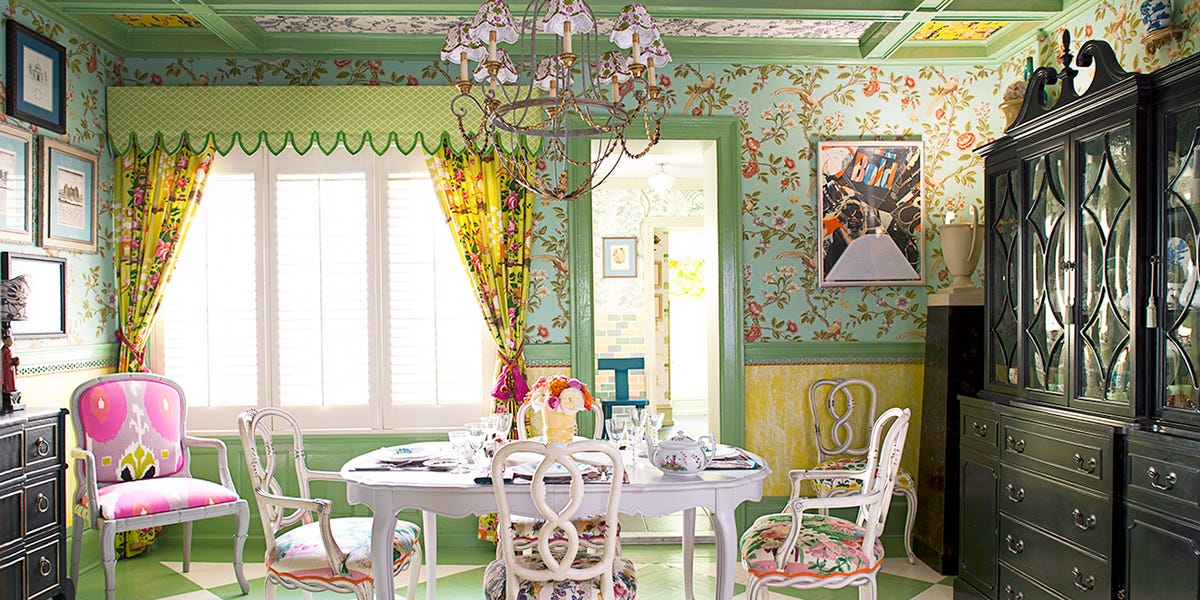
|
Anonymous
|
I don't care about your wall signs, but please stop with the sliding barn doors and reclaimed wood feature walls. I saw so many bad farmhouse renovations when I was house hunting.
I hate pretty much any faux-paint techniques. Rag rolling, sponge painting, distressed cabinets, antiqued wood, crackle finishes, etc. I hate the early 2000s Tuscan thing. It's so bad, it makes 80s colonial look charming in comparison. I hate everything designed by Michael Graves, from his iconic buildings right down to the furniture and tea kettles. I love MCM because it's casual and easy for the average person to style. I also love more traditional interiors (think Mark Sikes) but I know I could never achieve this on my own. |
Anonymous
Same on both counts. Stupid wooden signs/word "art," barn doors (WTH?), big clocks, etc. - just awful. I love maximalism done well and I also love certain traditional aesthetics including e.g. Duncan Phyfe furniture, chinoiserie, beautiful wallpaper, original art framed in interesting frames and mixed in with other things, marble and brass, acorn finials, the list goes on. I'm not a millennial but follow some grandmillennial instagram pages. |
Anonymous
PP here an no, I do not. The color balance is all wrong as is the furniture weight/size balance. That giant dark break front draws the eye even though it's one of the least interesting things in the room, the combination of fabrics, though bright and patterned, does not provide good contrast (it all just becomes a pink/green/yello mush instead of something your eyes dance over), I do not understand the art to the right of the doorway in relationship ti the rest of the room, etc. But there are elements here I think could be great (the wallpaper, the green and yellow colors scheme, a lot of the furniture if finished in a different color or combined with other things. This just looks like someone with no real taste who is, maybe color blind. |