What decor style do you absolutely HATE?!
Anonymous
| Memphis style. |
Anonymous
| I hate black faucets and shower heads. I don’t mind black cabinet hardware and light fixtures, but the faucets are just too much. |
Anonymous
| Hate farm house sinks |
Anonymous
| Vessel sinks. I hate those things with a passion! |
Anonymous
Very good point. A lot of what people hate about MCM is just a small subset of what it can be. I also think one reason MCM is popular among urbanites is that it is often apartment sized, and before the MCM revival trend, it could be incredibly hard to find living room or dining furniture that worked in an apartment or small row house. I remember struggling to find a couch that worked in my tiny post-college apartment back in the mid 00s and having to settle for a loveseat because nothing else would fit. A few year later I upgraded to a full size MCM sofa that I could stretch out on but that at very compact, square proportions so it worked. In our current apartment, I am actually not sure we could do another style of dining table/chairs than MCM because our dining area is very small and MCM is so much more streamlined than most other styles. |
Anonymous
|
I only have hate for the decor and style in my own house that I’m trying to update. For example, the 1980s cherry colonial style cabinetry. The brass ceiling fixtures. The cream everything. The builder grade “tumbled” bathroom tile.
I love an eclectic mix of midcentury modern-ish mixed with collected pieces from travel and family. It suits my home and comfort. I honestly don’t care what anyone else does because I don’t have to look at it. |
Anonymous
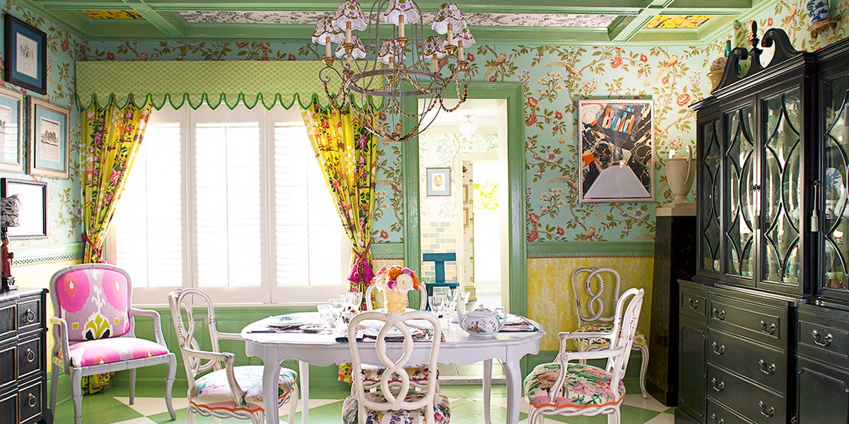
I think the contrasting colors/patterns would work much better if the neutrals were consistent. The two large pieces of black furniture flanking a white table and chairs just doesn't make sense. It makes it all look incongruous and when you then through the different patterns and the slightly clashing colors on top of that, it doesn't work. But I think you could get away with all the patterns if the wood was all the same neutrals or at least complementary instead of high contrast. I also think in a maximalist space, that much solid black/white/gray is wasted opportunity. Paint that table and chairs green, do the trim in yellow, paint the chest of drawers dark green, paint the break front a pale pink and then do patterned inserts on the solid doors, that kind of thing. I don't think the art on the facing wall is going to work no matter what, but the basic frame isn't helping -- you need something with color or pattern or interest there. |
Anonymous
| Black windows!! |
Anonymous
I once saw an interior designer on a season of This Old House express a love for a vessel sink because it allowed them to make the sink an actual design element instead of just dropping a cream or white porcelain sink under the counter. That was so enlightening because I too hate vessel sinks and have never understood why someone would do it. But now I get it -- it's a designer getting cute and trying to be fancy while ignore practical concerns. Very typical! |
Anonymous
|
I hate...(many repeats from previous posts)
vessel sinks. Huge TVs in the middle of the only living room on the main floor. Huge new, expensive houses that people haven't bothered to fully furnish. Poorly laid out furniture. My sister in law, for example, has a sectional that she's always laying out with the longest side facing out to the walkway. Makes the house (already small) feel incredibly small. |
Anonymous
|
I like both chinoiserie and MCM, clearly OP and I have different taste.
Things I don’t like: Rustic Industrial Barn doors not on barns Black window frames Almost everything else I can appreciate when done well. |
Anonymous
That's beautiful. |

Anonymous
Actually you couldn’t be more off-base. The Womb Chair is an iconic piece of mid-century furniture. It is anything but uncomfortable. If this doesn’t feel “organic,” I don’t know what is. 
|
Anonymous
| Giant screened porches that are not furnished or used ever |
Anonymous
See for me this is stark and minimalist enough to be interesting again. I wouldn't do my house in this style but much prefer it over the lame grey wood--greige upholstery--black fixtures--Houzz transitional-semi Scandi style--flipped look.* Commit to a style (like this) and there's some energy there. *Yes, I'm sure my house has some of this so don't at me... |