I don't like where design bloggers are going right now
Anonymous
|
Anyone else follow home design bloggers and find yourself scratching your head these days? Am I just getting too old? This is just one example.
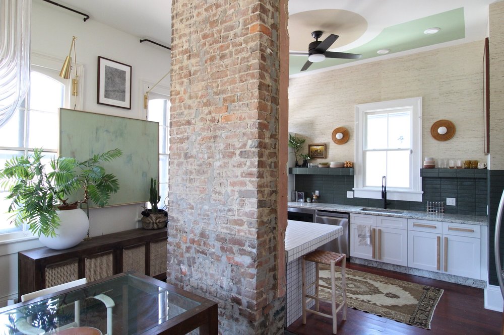
I was clicking through the One Room Challenge rooms that were posted in the paint trends thread and found this before and after of a kitchen. Before is a pretty typical, all-white kitchen. Nothing fancy. What would you do to it if sponsors were paying? I think I'd paint, change the counters, redo the floors, put in a beautiful backsplash, and add an island with some really awesome lights over it. 
This is the after. The comments on the blog post are all like "you're amazing!" 

|
Anonymous
|
Don't get your design inspiration from bloggers. Get it from legitimate, high end designers. There are only a few magazines left that showcase their work but they are out there. Home and Garden UK, World of Interiors, AD (if a little one-note), Veranda, etc.
One blog exception is Quintessence. I don't love all of the houses they show but they are always interesting. When you see a magazine spread that you like, follow that designer on Instagram or whatever. Bloggers sell clicks and content, not design services. There's nothing wrong with it but it's pretty different. You can also add more "editorial" stuff like Cabana to your diet. |
Anonymous
| The majority (12 out of 20) of the sponsored ORC participants are professional designers. |
Anonymous
What are their qualifications/history? There are tons of "professional designers" out there. Most of them lack taste. |
Anonymous
| That island is a nightmare -- cleaning difficulty, unlevel surface, etc..! A lot of form over function, which is more likely with a decorator (untrained, not licensed) than a professional interior designer (trained, licensed via passing a series of exams). |
Anonymous
Oh wow I didn't see all the photos yet. Yes, this is very form over function. How do you get to the windows with that picture hanging in the way? Rough wall finish in a kitchen? I suppose this aesthetic pleases some people, but the actual intentional design (way it works, deliberate decisions, task-oriented features) is severely lacking. |
Anonymous
I love it. It's so different. |
Anonymous
Island not good due to inability to clean also I'd never have wallpaper next to a stove. It would be a grease magnet and get nasty. |
Anonymous
|
Also, what is with the raw wood handles?
Before handles were way more cleanable. |
Anonymous
| I like it, but it looks a little cluttered. I would get rid of that credenza and painting on the wall between 2 windows. |
Anonymous
|
Virtually no storage in the "after"
I prefer the before.; storage, cleanable handles on cabinetry, |
Anonymous
| The trend is moving back to busy, multi-color, multi-texture, multi-layered looks. Not my thing, but I get where it's coming from. |
Anonymous
|
What is with the beverage fridge just thrown over on the side? Is that the FRONT DOOR? So the landing zone for keys and whatever is the beverage fridge?
The floors look terrible. That island is exactly the kind of thing people rip immediately. No one wants all that grout on an eating surface. Also, it looks like there is 6" of clearance between the stools and the tabletop. So awkward. |
Anonymous
| There are two, counter-height tables separated by a chimney. Okay. |
Anonymous
| It does look a little cluttered and inefficient, but I'm so tired of gray and white everything. It's especially nice to see color in kitchens again here. |