Kamala Harris Fashion Thread

Anonymous
Anonymous wrote:The blue suit cover looks so very DC, so safe, so boring. She looks great but like she'd been standing there for an hour, and that this is the 33rd shot they took (she's got the "come on already, i have actual work to do" look in her eyes).

The one they chose, in Chucks, is WAY better in my opinion - there is so much more life and personality in it. It's also fresh, a new pose and a new energy we've seen from Kamala before; it kind of channels a mix of energy from that awesome dancing gif of hers and the energy of a serious and competent prosecutor. Much more New York, as well.

I think they made the right choice for a fashion magazine. A tad risque, but what's fashion without a surprise?.


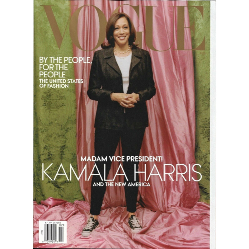
I'm fine with the picture, I said earlier I'd be fine if it was with an edgier backdrop and but that prom backdrop is awful. It's WRINKLED for god's sake. I get that the colors are supposed to be an homage to her sorority, but UGH, it's awful.
Anonymous
Where is the fashion?
Anonymous
Anonymous wrote:Is it just me or did they also overly photo shop her so she's almost... blurry?

Cause the real thing isn't all that great. DUH
Anonymous
Anonymous wrote:
Anonymous wrote:Is it just me or did they also overly photo shop her so she's almost... blurry?

Cause the real thing isn't all that great. DUH


That’s not true- she looks incredible on live television. The vogue photo does seem weirdly out of focus.
Anonymous
As someone with boobs, I effing HATE when my shirt does this under a jacket and holy hell would I be pissed if it was like that on a frigging Vogue cover.
Anonymous
It’s just so sloppy. Put her in an office, pink and green flowers on the desk. Put her in something that fits. Tell her you are taking the picture now! Ugh. I feel for her. I know she has bigger things going on but this could have been a big moment and it’s just annoying.

Anonymous
Yeah I can’t, for the life of me, understand why Vogue thought this was a great cover. Oh well. It’s pure Kamala & she’s pretty awesome as-is, but....a little glamour and makeup and wardrobe is what Vogue covers are all about! The lame background is the worst part.
Anonymous
+1
Anonymous
Anonymous wrote:
Anonymous wrote:
Anonymous wrote:I think Vogue knew exactly what it was doing. The photo is horrible and causing controversy. $$$.

Vogue’s cover makes the VP look like a thug. I’ll never believe Wintour made a “mistake. This was intentional.


Well, here's one person who won't be paying for it. It's pretty well known that Anna Winter is a racist, isn't it?

Yes yes
Anonymous
Anonymous wrote:As someone with boobs, I effing HATE when my shirt does this under a jacket and holy hell would I be pissed if it was like that on a frigging Vogue cover.


I truly adore Kamala Harris and I think she's beautiful. This cover is just awful. The outfit, the shirt, the sneakers, the background.

I think her sneakers are cute but for Vogue? Eh maybe not so bad if everything else wasn't so awful

I feel like that's the kind of backdrop I'd come up with in a hurry. I think the person who approved this didn't care for her.
Anonymous
Hips don’t lie.
Anonymous
Anonymous wrote:
Anonymous wrote:Apparently the nice blue suit cover is the cover for the digital version. The one with the chucks is the one they chose for the print version. I also don’t like it. And with the way you see the pink backdrop, it looks terrible, like they couldn’t even set it up properly. I get wanting her to seem down to earth or whatever, but the blue one is just so much better


Anna Wintour chose it—not Harris.


Kamala needs better people. They should have insisted on cover choice or approval.
Anonymous
Anonymous wrote:
Anonymous wrote:
Anonymous wrote:Apparently the nice blue suit cover is the cover for the digital version. The one with the chucks is the one they chose for the print version. I also don’t like it. And with the way you see the pink backdrop, it looks terrible, like they couldn’t even set it up properly. I get wanting her to seem down to earth or whatever, but the blue one is just so much better


Anna Wintour chose it—not Harris.


Kamala needs better people. They should have insisted on cover choice or approval.

Keep up. Harris’s team and Vogue did agree on a set of approved photos. Anna Wintour ignored the agreement and basically put a throw away test shot on the cover and sent it to print. Now says they wanted Harris to “look approachable”. (But of course achieved the opposite. Oops).
Anonymous
Anonymous wrote:
Anonymous wrote:As someone with boobs, I effing HATE when my shirt does this under a jacket and holy hell would I be pissed if it was like that on a frigging Vogue cover.


I truly adore Kamala Harris and I think she's beautiful. This cover is just awful. The outfit, the shirt, the sneakers, the background.

I think her sneakers are cute but for Vogue? Eh maybe not so bad if everything else wasn't so awful

I feel like that's the kind of backdrop I'd come up with in a hurry. I think the person who approved this didn't care for her.


It’s a bad cover. It really feels like something that was thrown together in 10 minutes with leftover props. The heart of the matter for me is that it doesn’t feel artistic, like a vogue cover should be. It looks like a picture that would have run in the express newspaper.
Anonymous
Anonymous wrote:
Anonymous wrote:
Anonymous wrote:
Anonymous wrote:Apparently the nice blue suit cover is the cover for the digital version. The one with the chucks is the one they chose for the print version. I also don’t like it. And with the way you see the pink backdrop, it looks terrible, like they couldn’t even set it up properly. I get wanting her to seem down to earth or whatever, but the blue one is just so much better


Anna Wintour chose it—not Harris.


Kamala needs better people. They should have insisted on cover choice or approval.

Keep up. Harris’s team and Vogue did agree on a set of approved photos. Anna Wintour ignored the agreement and basically put a throw away test shot on the cover and sent it to print. Now says they wanted Harris to “look approachable”. (But of course achieved the opposite. Oops).


Uh no you're wrong according to the NYT: Vogue had not granted any kind of contractual cover approval rights to Ms. Harris.

https://www.nytimes.com/2021/01/11/style/kamala-harris-vogue.html

With vogue's racist history, you get that ish in writing
Forum Index » Beauty and Fashion
Go to: