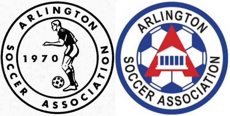
New Arlington Logo
Anonymous
Agreed. New one is just that bad. |
Anonymous
They should've just kept the original logo, with Grandpa trying to kick a soccer ball.
|
Anonymous
The old one is certainly more dignified and classy than the new one... |
Anonymous
| Arlington probably wanted to get rid of robert e lee’s house on the logo. |
Anonymous
Arlington's "new" and "modern" logo is just a rip-off of the 1970s New York Cosmos logo.

https://imgur.com/a/GzbDS41? |
Anonymous
Bingo |
Anonymous
agree. very retro which given the 50th ann was probably the intent. I'm personally not a fan, but i think they probably achieved their goal. |
Anonymous
|
Wait, the club was est in 1970 or the logo? There aren't that many nice looking logos for clubs in this area. I've seen a few that are ok.
Let's take this thread off course to really tick off the Arlington faithfuls....which club has the best logo? |
Anonymous
Well, clearly FCV as they are the best at everything including logos. Followed closely by McLean, BRYC, SYC, Barca, LMVSC, Bethesda, and Loudoun. Seriously, I think the new logo is fine, although maybe they should have put Amazon in the logo somehow since most parents will be working for them soon enough. |
Anonymous
Isn't the old one on the left? I may be dense: where's the house? |
Anonymous
Thank you! I needed a good chuckle! 
|
Anonymous
The one on the right, the white house in the middle of the A. |
Anonymous
| This thread definitely wins a prize for "Pointless First World Problem" |
Anonymous
Oh, thank you. The one on the left had such a dated look with those shorts and the soccer ball, I thought that was it. I do see the house on the other logo. |
Anonymous
| Well, we do have LMVSC with their General Lee like logo and they win for making a acronym longer that most grade school words! |