Thoughts on this paint color-SW Divine White
Anonymous
|
I am struggling with paint colors for a tile floor throughout my house.(Can't change the floors yet.) It resembles travertine but has pink, rust, beige tones depending on light/time of day.
A small SW Divine White paint chip looks great with it. Does it look dated? I would do a coordinating brighter white ceiling/trim? Also do you like the dark color around the windows? Thinking of painting the interior of the front door something similar if I can find a dark color to coordinate with floors. This pic is from a current catalogue. 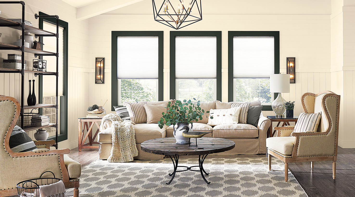
|
Anonymous
| Get a sample pot and paint a few big swatches on the walls. And maybe one on a board you can put on the tile. |
Anonymous
|
I don’t care for the dark trim simply because as I age, I have more and more trouble with strong contrasts in color (I’m going to end up in a beige room just to not have any color differences, lol).
And that looks like a *very* yellow white, almost more of a pale yellow than a yellow white. If that’s what you’re going for, that’s great, obviously, but I would paint big swatches (or Samplize or paint poster board, etc). |
Anonymous
| I see yellow too. I wouldn’t say it looks dated in that photo because of the dark trim. I don’t think it looks modern though. |
Anonymous
| I think it looks dingy with the car trim ,but it might look fresh with bright white trim. |
Anonymous
|
Looks yellow to me, too.
My house has the creamy yellow that was popular in the late 90s/early 2000s, and I’m looking for a true white. My problem is my house doesn’t get a lot of natural light. |
Anonymous
|
Looking at my SW white paint sampler, Divine White is classified as a "Warm" white.
Given that, I have the following comments. Does your upholstery, pillows or woods trend warms or not? Does Divine White complement them or is it just too much warm? It seems that whites and neutrals are trending away from cools and greys back towards warm. Do you want to follow that trend? It may help you to get a sample can and paint it on the wall or a piece of wood or a stick-on sample from Samplize. |
Anonymous
| It looks yellow to me, too. Have you looked at SW Creamy. It's another warm white, but isn't as yellow as this color. |
Anonymous
| I'm pretty sure this is the color our previous owners painted throughout our entire house. If you have a lot of natural light in the home, you will probably be fine. We do not and even with bright white trim it always looks dark and yellow-tan. Not crisp and welcoming. |
Anonymous
|
OP here- Thank you for your input. I got the SW white color card and ordered a few samples from Samplize. Its warm so leaning more towards their neutral whites-Pure White, Extra White and High reflective white which look more modern.
|
Anonymous
| Our teen DD chose this for her bedroom color because everything else we tried that was a cooler shade looked really cold and washed out. In that room, it doesn't look anywhere close to as yellow as that picture so it must be one of those colors that are really affected by the light and space. |
Anonymous
| Another poster mentioned Sherwin Williams White Duck a few days ago, and I have fallen in love with it! Have you seen that one yet? |
Anonymous
| I have SW Dover, another warm white, and SW Shell White, technically classified as a neutral white but it has a bit of a yellow cast. Dover can have a very slight greenish cast. |
Anonymous
I have Shell White and it’s definitely yellow-beigey but to me it’s very fresh looking and it goes well with our oak floors. But it’s definitely not the cool grey thing. |
Anonymous
| OP- I actually picked up that color card from SW. Its all about warm neutrals. The other coordinating colors on the card are beige and feel dated to me. |