What color to paint for staging?
Anonymous
| Benjamine Moore Pale Oak is also a beautiful neutral, just slightly more noticeable on the walls and against the trim than Classic Grey. |
Anonymous
Agree with Chantilly Lace- it is sterile and cold looking color! |
Anonymous
If you're painting a room or two in your home, then the difference is negligible and the BM supposedly has longer staying power, which will pay off in the long run (this has been my experience, too). If you're painting an entire apartment that you do not intend to live in then the higher cost of BM adds up for little benefit. |
Anonymous
| Grey will make it feel dated, not fresh |
Anonymous
There is different quality levels within both brands. Our house was originally painted with the cheapest SW Promar paint that contractors use. When we repainted we used BM Regal Select in matte. It is a huge difference in terms of both look and ability to clean it. I can wash stains from the BM paint. And that is still not their highest end paint. SW also has paint that is better than Promar and in the end, unless you are painting a McMansion the difference in the cost of crappy and good quality paint won’t be huge. |
Anonymous
Also agree. Unless the style of the house calls for it, the high end market does not go for stark whites like the two suggested. Warm whites like Swiss Coffee, Alabaster or Greek Villa are all the rage. If you have stark white trim you need to be careful with these though, as some could read yellow next to it. |
Anonymous
This is such a good point. The shade has to work with existing wood, tile, brickwork, cabinets, etc. otherwise it will look worse. |
Anonymous
|
Agree gray is a turnoff to me. Cannot fathom why people want cold, sterile gray interiors that remind me of hospitals. Which is ironic as hospitals now embrace warmer colors, on purpose.
Regardless of what agents tell you, my gut instinct is a high quality paint job is more important than any soft colors you pick, whether pale gray or pale cream. Painting in bold colors is a mistake. |
Anonymous
|
SW Alabaster or Greek Villa with bright white trim to make your windows/trim pop.
Do not spend more for BM paint. Silly. You just need the fresh paint job. |
Anonymous
It's a neutralish color that hides stains, which is why it's seen more in rent houses and lower income areas. |
Anonymous
Yep. But hospitals should just go back to the hospital green color. Was the most soothing overall. |
Anonymous
Well, classic gray is a pretty warm color. But the main thing is that OP says she has revere pewter, and clearly put thought into the colors she chose. As other PPs have pointed out, the main thing is that she picks something light that is harmonious with her flooring, tile, cabinets, trim etc. We all saw houses in 2009 that had orangey floors and white trim with yellow undertones that someone painted a cool gray to try to “modernize” them for staging, and it looked horrible. OP needs to avoid that at all costs. So even though classic gray might not be trendy, it is very likely to look good with her other finishes and that is way more important. Sure, there might be a different color that is better. But someone would have to be there in person figuring that out. |
Anonymous
[img]
Lol |
Anonymous
|
The other thing I think classic gray has going for it is that it photographs well with other neutral staging stuff. So it’s easy for photographers to tinker with brightness etc because nothing ends up weird.
Like this: 
Here: 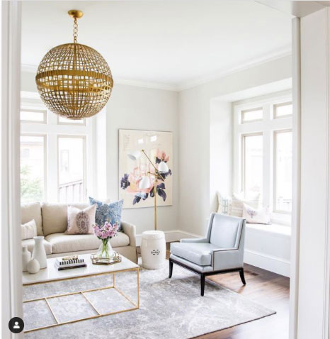
Or here darker: 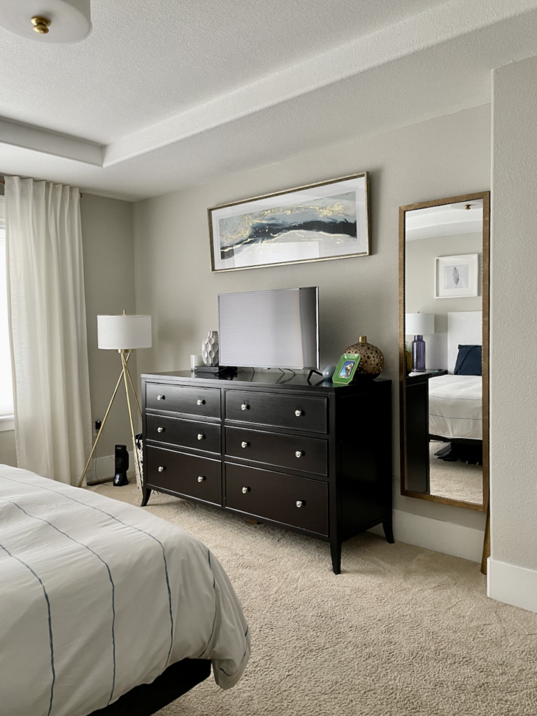
None of this is trendy, it’s bland for sure, but they are fine for real estate listing photos. Here’s an example of where even though classic gray is pretty easygoing, it doesn’t match this big red rug. And there’s nothing the photographer can do about the big red rug, because if they give it the Instagram brightness treatment, it will end up looking very weird. If you have the cabinet/tile/flooring equivalent of this big red rug, where you don’t have the option to remove it, you HAVE to work with it. Because no neutral can change that. 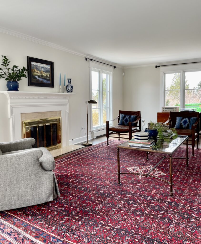
|
Anonymous
|
Good lord some of that furniture in the previous post sure looks awful and cheap. Amazing people will spend tons of money for Ikea type garbage.
The last pic is not too bad overall. The bedroom pic looks like a motel. 
|