Lily Allen and David Harbour's Brooklyn Townhouse (Architectural Digest)
Anonymous
Here is another Brooklyn house and it’s divine! Idk what happened. https://billycotton.com/project/coffey-street |
Anonymous
These give the look of summer camp in the off season. Don't hate it! |
Anonymous
Maybe I hate some of it. This is supposed to make me hire this designer?! 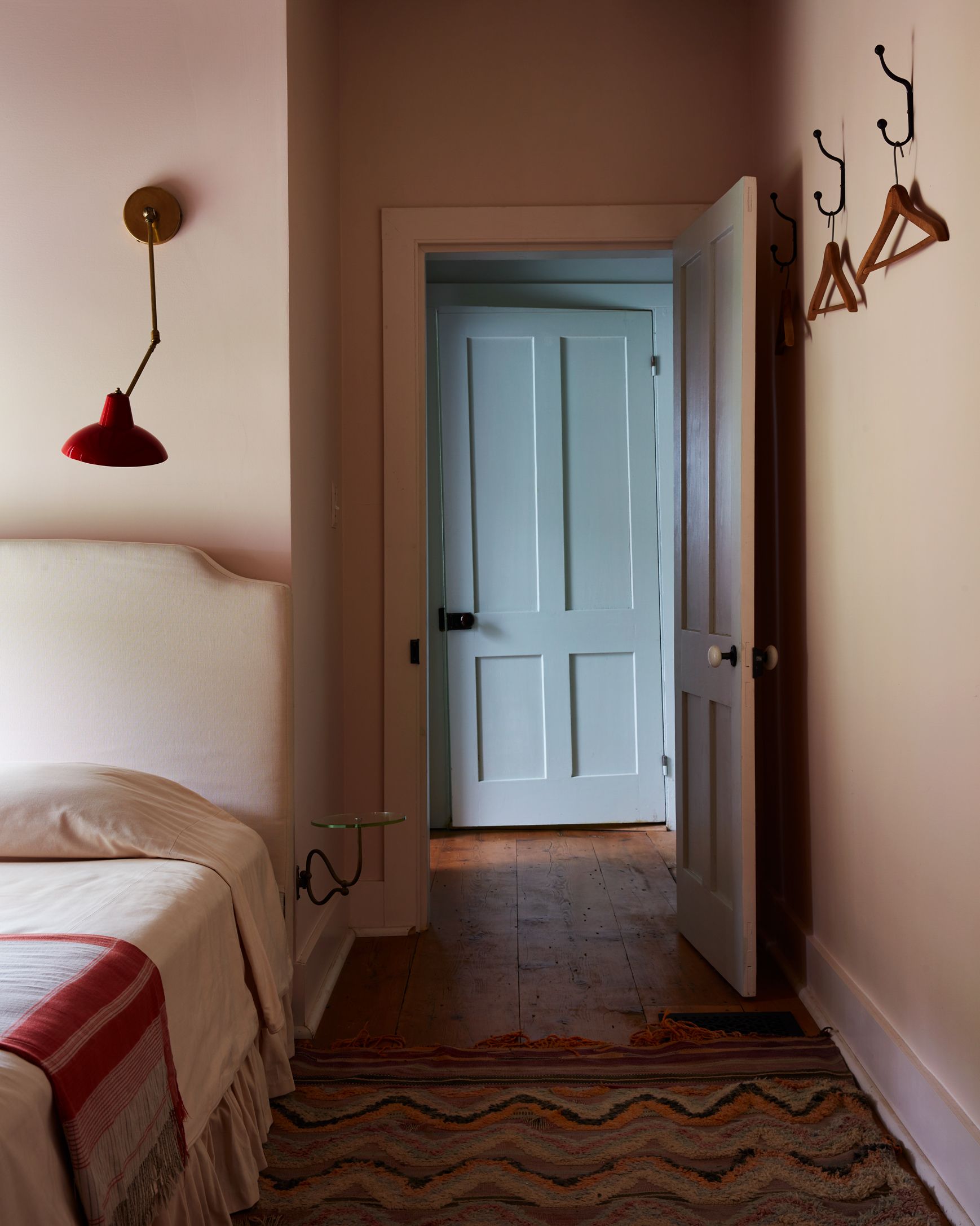
Am I just not with it enough to know what I am looking at and why it's so special? |
Anonymous
This looks like a London flat right after WW2. The kitchen is giving major "Call the Midwife" vibes of deprivation: 
And "an antique wicker sofa repurposed as a child’s bed" - I thought, oh, this could be cute. The bed: |
Anonymous
DP, but her Wikipedia says she actually did live on council estate when she was a kid! |
Anonymous
The bed: 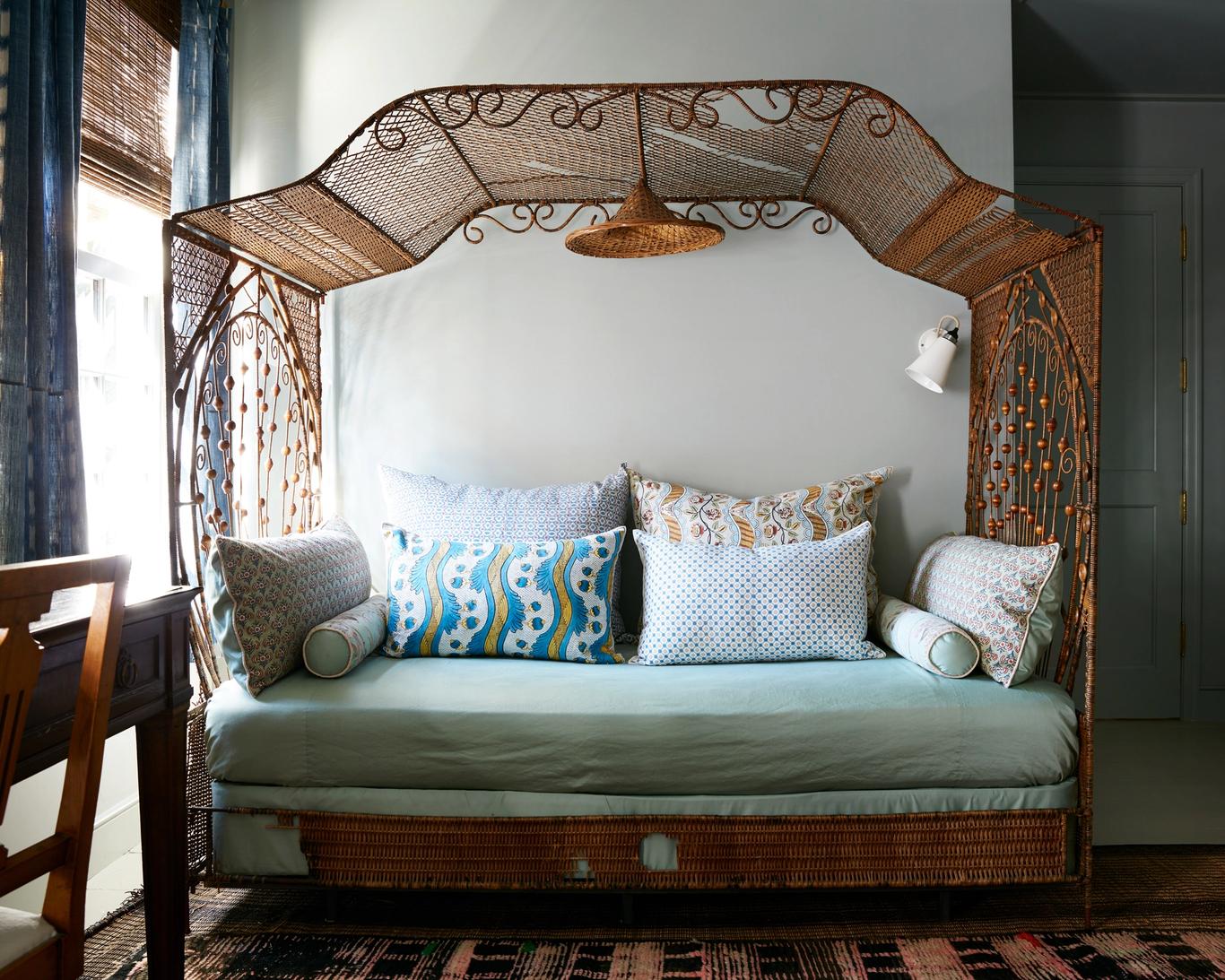
|
Anonymous
I really want to know what they tore out to make that kitchen. And if they had to special order the mattress with extra lumps, or if they just poked around on street curbs until they found one looking derelict enough. |
Anonymous
I think the bed is so cute! To each their own I guess. |
Anonymous
Simple. I don't know *who* she is. |
Anonymous
I mean it’s moody photography. But to me there’s some good stuff here. They either preserved or found the lovely doors and appropriate hardware. The floors are beautiful. The blue color on the door is pretty. The bed looks inviting and to make it work in a very small space, they’ve added the sconce and the little wall-mounted table. It’s kind of a tripping hazard but it works well enough. The sconce is mixing in a strong color and another period in a way that works for me. The rug and the hooks are pretty and functional. |
Anonymous
Which is exactly how she ended up with PP's "grew up in council estates but have money now so want to look like landed gentry" vibe. 
|
Anonymous
Agree I like their other work much more. I think it might be the scale of the house and the rooms? Their other houses seem to have all these “small moments” like you would turn a corner and the view down the hallway is perfectly composed with the way the hallway rug and the floor lamp in the next room and the wall color from the kitchen come together. In the Allen/Harbour house it looks more like a series of sets that don’t work together— the green sitting room, the checked and neutral kitchen, the blue tile bathroom, that weird pink bed. They don’t work together, it’s hard to imagine living in this house or moving from room to room. |
Anonymous
This looks to me like a less interesting version of the old houses I grew up going to in New England. Like you saw nice floors and decided to make everything else as uninviting and bare bones as possible. Like if you looked up "what's the opposite of cozy and inviting" you'd see this picture. |
Anonymous
We (NP here) clearly have a different idea of inviting. The bed looks like it would inviting for a monk who plans on self-flagelating in his spare time. The mounted table is going to cause bruised when you slam your thigh/knee into it trying to pass it in the night. Agree that the doors and floors are nice, but likely original so no props to the decoator from me. |
Anonymous
Eh, lots of people who grew up with money have poor taste. If Allen had grown up poor or LMC, I’d actually expect her to have better taste because putting together her career without connections would require really good taste in how she presented herself to get by gatekeepers. This house makes me think she’s a dilettante— has money to spend on designers and objects, lacks the patience, research skills, attention to detail, etc. to actually do it well. This doesn’t scream “new money” to me, just bad taste. Those are different. |