The blandest of them all

Anonymous
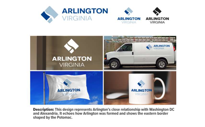
Arlington's new logo. Just the most middling piece of graphic design I've seen since 1994. Is the future of this county to be completely devoid of any personality or distinctiveness? Who approves these things?

Anonymous
Through the bold blandness of its design, the logo represents the utter blah of the ARL.

Anonymous
I love the new Arlington logo. I guess different people have different opinions.
Anonymous
It’s soulless and boring, just like Arlington. Really couldn’t be a better representation.
Anonymous
Why does the logo include DC? Why are they establishing their identity based on DC? It seems very subservient and indicates a poor mindset when Arlington stands on its own and has a much better future prospect than DC. Airport. Amazon/Crystal City. Pentagon. Rosslyn/Clarendon/Ballston.

Arlington could cut itself off from DC and thrive. The same cannot be said for the other way around.
Anonymous
Bland logo for a bland place full of bland people. Seems logical and on brand to me.
Anonymous
Anonymous wrote:Why does the logo include DC? Why are they establishing their identity based on DC? It seems very subservient and indicates a poor mindset when Arlington stands on its own and has a much better future prospect than DC. Airport. Amazon/Crystal City. Pentagon. Rosslyn/Clarendon/Ballston.

Arlington could cut itself off from DC and thrive. The same cannot be said for the other way around.


"The chosen design represents Arlington’s close relationship with DC and Alexandria and echoes how the County was formed, as well as its Potomac River border on the east."

Sounds good to me.
Anonymous
Anonymous wrote:
Anonymous wrote:Why does the logo include DC? Why are they establishing their identity based on DC? It seems very subservient and indicates a poor mindset when Arlington stands on its own and has a much better future prospect than DC. Airport. Amazon/Crystal City. Pentagon. Rosslyn/Clarendon/Ballston.

Arlington could cut itself off from DC and thrive. The same cannot be said for the other way around.


"The chosen design represents Arlington’s close relationship with DC and Alexandria and echoes how the County was formed, as well as its Potomac River border on the east."

Sounds good to me.

Pathetic. Stand on your own or don’t stand at all. I honestly have lost respect for Arlington now. What a statement of insecurity.
Anonymous
Anonymous wrote:
Anonymous wrote:
Anonymous wrote:Why does the logo include DC? Why are they establishing their identity based on DC? It seems very subservient and indicates a poor mindset when Arlington stands on its own and has a much better future prospect than DC. Airport. Amazon/Crystal City. Pentagon. Rosslyn/Clarendon/Ballston.

Arlington could cut itself off from DC and thrive. The same cannot be said for the other way around.


"The chosen design represents Arlington’s close relationship with DC and Alexandria and echoes how the County was formed, as well as its Potomac River border on the east."

Sounds good to me.

Pathetic. Stand on your own or don’t stand at all. I honestly have lost respect for Arlington now. What a statement of insecurity.


Where do you live?
Anonymous
Most organizations seem compelled to go through exercises like this that seem to exist only to consume staff time, money and focus. How many staff hours went into the meetings and memos and paperwork that went into this design? How much did they pay the design company and consultant? How much will it cost to change over all the documents, websites, apps, building signage and outdoor signs to incorporate the new logo?

And, finally, if county employees hadn't been researching/reading/meeting/implementing about the logo, does the county have any problems that they could have been working on?

This logo is what sub-optimal organizations choose to spend their resources ("our resources" in this case) on.
Anonymous
Anonymous wrote:Most organizations seem compelled to go through exercises like this that seem to exist only to consume staff time, money and focus. How many staff hours went into the meetings and memos and paperwork that went into this design? How much did they pay the design company and consultant? How much will it cost to change over all the documents, websites, apps, building signage and outdoor signs to incorporate the new logo?

And, finally, if county employees hadn't been researching/reading/meeting/implementing about the logo, does the county have any problems that they could have been working on?

This logo is what sub-optimal organizations choose to spend their resources ("our resources" in this case) on.


How much time did you spend posting about this, and are there any other things you could have more usefully spent your time doing?
Anonymous
I'd like it better if "Arlington" were written in Comic Sans.
Anonymous
Anonymous wrote:I'd like it better if "Arlington" were written in Comic Sans.

LOL
Anonymous
Arlington could cut itself off from DC and thrive. The same cannot be said for the other way around.

So if you put Arlington in Missouri, nowhere near DC, it would be the same thing it is now? Really?

DC would still be DC without Arlington. In fact it would be bigger if Arlington had never existed. You can’t say the opposite, at all.
Anonymous
Anonymous wrote:Why does the logo include DC? Why are they establishing their identity based on DC? It seems very subservient and indicates a poor mindset when Arlington stands on its own and has a much better future prospect than DC. Airport. Amazon/Crystal City. Pentagon. Rosslyn/Clarendon/Ballston.

Arlington could cut itself off from DC and thrive. The same cannot be said for the other way around.


What a bizarre assertion. If Arlington sunk into the Potomac, HQ2 would be in DC, DoD workers would disperse throughout the entire region, and people would fly out of Dulles or BWI. Arlington is neat and all, but c'mon. Be serious.
post reply Forum Index » Metropolitan DC Local Politics
Message Quick Reply
Go to: