Anonymous
Well, we do have LMVSC with their General Lee like logo and they win for making a acronym longer that most grade school words!
Anonymous
Anonymous wrote:Anonymous wrote:Anonymous wrote:Anonymous wrote:Arlington probably wanted to get rid of robert e lee’s house on the logo.
Bingo
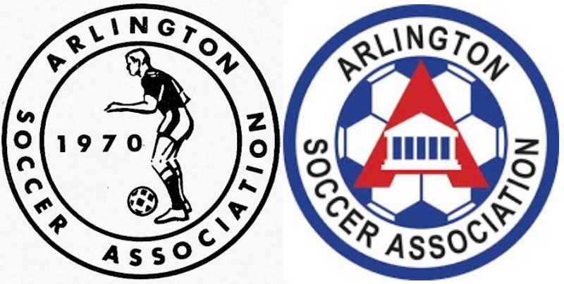
Isn't the old one on the left? I may be dense: where's the house?
The one on the right, the white house in the middle of the A.
Oh, thank you. The one on the left had such a dated look with those shorts and the soccer ball, I thought that was it. I do see the house on the other logo.
Anonymous
This thread definitely wins a prize for "Pointless First World Problem"
Anonymous
Anonymous wrote:Anonymous wrote:Anonymous wrote:Arlington probably wanted to get rid of robert e lee’s house on the logo.
Bingo
Isn't the old one on the left? I may be dense: where's the house?
The one on the right, the white house in the middle of the A.
Anonymous
Anonymous wrote:Anonymous wrote:Wait, the club was est in 1970 or the logo? There aren't that many nice looking logos for clubs in this area. I've seen a few that are ok.
Let's take this thread off course to really tick off the Arlington faithfuls....which club has the best logo?
Well, clearly FCV as they are the best at everything including logos. Followed closely by McLean, BRYC, SYC, Barca, LMVSC, Bethesda, and Loudoun. Seriously, I think the new logo is fine, although maybe they should have put Amazon in the logo somehow since most parents will be working for them soon enough.
Thank you! I needed a good chuckle!

Anonymous
Anonymous wrote:Anonymous wrote:Arlington probably wanted to get rid of robert e lee’s house on the logo.
Bingo
Isn't the old one on the left? I may be dense: where's the house?
Anonymous
Anonymous wrote:Wait, the club was est in 1970 or the logo? There aren't that many nice looking logos for clubs in this area. I've seen a few that are ok.
Let's take this thread off course to really tick off the Arlington faithfuls....which club has the best logo?
Well, clearly FCV as they are the best at everything including logos. Followed closely by McLean, BRYC, SYC, Barca, LMVSC, Bethesda, and Loudoun. Seriously, I think the new logo is fine, although maybe they should have put Amazon in the logo somehow since most parents will be working for them soon enough.
Anonymous
Wait, the club was est in 1970 or the logo? There aren't that many nice looking logos for clubs in this area. I've seen a few that are ok.
Let's take this thread off course to really tick off the Arlington faithfuls....which club has the best logo?
Let's take this thread off course to really tick off the Arlington faithfuls....which club has the best logo?
Anonymous
Anonymous wrote:Makes sense to get rid of the County seal since they aren’t a County Club. They heavily serve kids from DC, MD, Prince William and Fairfax counties after U12. At least this shows they recognize that.
Arlington should form another Club who has a more community-based focus since at 10,000 players it is way too big to adequately provide the needs and individual attention of players.
Not a fan of Arl, but oddly like this new logo. It’s very retro, just like my 1970s-style New Balance sneakers.
agree. very retro which given the 50th ann was probably the intent. I'm personally not a fan, but i think they probably achieved their goal.
Anonymous
Anonymous wrote:Arlington probably wanted to get rid of robert e lee’s house on the logo.
Bingo
Anonymous
Arlington's "new" and "modern" logo is just a rip-off of the 1970s New York Cosmos logo.

https://imgur.com/a/GzbDS41?
https://imgur.com/a/GzbDS41?
Anonymous
Arlington probably wanted to get rid of robert e lee’s house on the logo.
Anonymous
Anonymous wrote:They should've just kept the original logo, with Grandpa trying to kick a soccer ball.
The old one is certainly more dignified and classy than the new one...
Anonymous
They should've just kept the original logo, with Grandpa trying to kick a soccer ball.
Anonymous
Anonymous wrote:Why does anyone care. It wasn’t like old one was some design wonder.
Agreed. New one is just that bad.