Anonymous
Anonymous wrote:The idiots across the street from me put in a huge, 12 foot long, mullion-less window across the front of their house, looking in on their kitchen. No window coverings.
First of all, there is a reason that kitchens are historically in the back of the house. No one wants to watch you make coffee in your nightgown at 7:30 in the morning.
I get that they wanted a certain "look" The casements are black, it's trying very hard to be modern, and I'm sure they were expensive and custom. But it's horrible. No only does it look like a dentist's office, it makes everyone OUTSIDE the house, an unwilling spectator of your every move.
you can see me making coffee in my kitchen window if you're walking by and look in but idgaf because i'm in my own freaking house
Anonymous
Gray everything. So depressing.
Anonymous
The idiots across the street from me put in a huge, 12 foot long, mullion-less window across the front of their house, looking in on their kitchen. No window coverings.
First of all, there is a reason that kitchens are historically in the back of the house. No one wants to watch you make coffee in your nightgown at 7:30 in the morning.
I get that they wanted a certain "look" The casements are black, it's trying very hard to be modern, and I'm sure they were expensive and custom. But it's horrible. No only does it look like a dentist's office, it makes everyone OUTSIDE the house, an unwilling spectator of your every move.
Anonymous
Anonymous wrote:I would rather have a house that has personality than a house that looks like everyone else's - like a follower. Middle school is over, ladies.
My kitchen is 26 X 15 with 9 foot ceilings, sporting an 8 x 3 foot island with cooktop in its eastern end. Twenty-five year old Toll Brothers home in 22039. Mostly builder basic appliances bc I"m Thoreauvian about some things..
When I decided to remodel it, I had Mirage maple floor installed to replace the (yuck) builder basic linoleum.
East wall I selected BM Million Dollar Red (to honor the rising sun) Other walls and ceiling are No Nonsense Yellow. Pantry door, French doors to sun room, door to basement are Hills of Ireland Green. Door to powder room is NNY (visual joke some of you will get). Trim is Peach Brandy. Door to garage is MDR.
I've owned my home free and clear since settlement. Ignored all that advice that "the smart money carries the biggest mortgage it can." Yeah, right. Why be a debt serf if you don't need to be?
I selected those colors to please myself. Intend to stay here until I croak, so I don't care what the next buyer likes. I'd coat my walls in coagulated bat guano before I'd follow the crowd with "Realtor beige."
I agree with the PP who said anyone with a credit card and internet connection can have a Pottery Barn home, that it shows no sense of style (or belief in one's own judgment) at all.
Anonymous
Anonymous wrote:Americans have gotten smart and ignore the failed attendees
Attempts at designers to get people to redesign their homes before they wear out. Stainless steel appliances, white cabinets, light granite or quartz, open floorplan, Mediterranean hardwood floors, light warm gray paint, subway tiles is a timeless look that will engage those trying to justify remodeling every 10 years
Lol, this look is the definition of trendy (although already past its peak) and will look dated in 5 years, if not earlier. If you don’t want your house to look as dated, you need to ignore trends.
Anonymous
Anonymous wrote:I hate light grey. I can deal with a dark charcoal in a room with lots of natural light and white trim but light grey everywhere is just dreary.
I hate kitchen islands in the middle of an L or u shaped kitchen. Its so annoying. I do like a huge island instead of a wall diving the kitchen/dining or kitchen/dining/family area. As long as there is a long open aisle where I can get from the fridge/counter to the range I'm fine. I really like galley layout kitchens.
I hate ranges built into kitchen islands. Worst idea ever.
I hate too many ovens. Who needs four ovens?? In luxury high end homes there can be two wall ovens, a double range and one regular/one smaller size oven underneath plus a microwave oven below the counter, two dishwashers, a restaurant sized fridge, walk in pantry, downstairs walk in wine room, and access to a built in outdoor kitchen with an oversized grill, sink and outdoor fridge. This doesn't count the outdoor bar area and indoor bar area plus small kitchenette in the guest or pool house. No one cooks this much.
I don't know what it is called but I hate when there is small path on the second floor with overlooks down to the the first floor on either side.
I hate columns too.
You forgot the basement kitchen.
Anonymous
HAHAHAHA....my current decor consists of large toys spread out in the basement, and my DC "decorating" the windows by placing their idea of "window treatments" in view of the persnickety, gossip neighbor. THIS should be interesting....
Anonymous
Anonymous wrote:Anonymous wrote:Anonymous wrote:"Accent walls" that are a different color from all the others
White walls with dark trim
Those coffee tables that are basically giant ottomans
Tufted/fabric headboards, especially if they look like wing chairs
Decorators talking about "a pop of color"
Inspirational sayings or kids names stenciled on walls
Having an island in your walk-in closet
Snout houses (houses with a front-load garage that sticks out farther than the rest of the house)
+1 for Snout Houses...absloutely hideous architecture and I hate them...some with the 3-car garage are really gross. Most production builders (particularly NV Homes)
have these models as their staple product. I once spoke to an architect friend about it and he mentioned this config allows builders to build a single
box with the garage in front of the kitchen and mud room...
With you on everything except the ottoman coffee tables and fabric headboards... We have two under two, which includes a very active toddler and a baby that's about to start exploring, and we currently err on the side of buying as much soft furniture as possible.
I also think white walls and dark trim has to come off the list because the Shakers did it so good. I want to add "spa-like" bathrooms. It's only "spa-like" to me if it comes with attendants and laundry service.

Anonymous
Anonymous wrote:Anonymous wrote:"Accent walls" that are a different color from all the others
White walls with dark trim
Those coffee tables that are basically giant ottomans
Tufted/fabric headboards, especially if they look like wing chairs
Decorators talking about "a pop of color"
Inspirational sayings or kids names stenciled on walls
Having an island in your walk-in closet
Snout houses (houses with a front-load garage that sticks out farther than the rest of the house)
+1 for Snout Houses...absloutely hideous architecture and I hate them...some with the 3-car garage are really gross. Most production builders (particularly NV Homes)
have these models as their staple product. I once spoke to an architect friend about it and he mentioned this config allows builders to build a single
box with the garage in front of the kitchen and mud room...
With you on everything except the ottoman coffee tables and fabric headboards... We have two under two, which includes a very active toddler and a baby that's about to start exploring, and we currently err on the side of buying as much soft furniture as possible.
Anonymous
Anonymous wrote:"Accent walls" that are a different color from all the others
White walls with dark trim
Those coffee tables that are basically giant ottomans
Tufted/fabric headboards, especially if they look like wing chairs
Decorators talking about "a pop of color"
Inspirational sayings or kids names stenciled on walls
Having an island in your walk-in closet
Snout houses (houses with a front-load garage that sticks out farther than the rest of the house)
+1
Or the opposite of Snout Houses - houses trying too hard not to be a "McMansion!" (said with contempt, and a bit of spittle) - but instead, looking like an overdone sh&tshack. A really, really, really long sh&tshack that is twice deep than it is wide. Because "it's NOT a McMansion!" (again, said with contempt and a bit more spittle).
Anonymous
Anonymous wrote:"Accent walls" that are a different color from all the others
White walls with dark trim
Those coffee tables that are basically giant ottomans
Tufted/fabric headboards, especially if they look like wing chairs
Decorators talking about "a pop of color"
Inspirational sayings or kids names stenciled on walls
Having an island in your walk-in closet
Snout houses (houses with a front-load garage that sticks out farther than the rest of the house)
+1 for Snout Houses...absloutely hideous architecture and I hate them...some with the 3-car garage are really gross. Most production builders (particularly NV Homes)
have these models as their staple product. I once spoke to an architect friend about it and he mentioned this config allows builders to build a single
box with the garage in front of the kitchen and mud room...
Anonymous
Anonymous wrote:Anonymous wrote:Anonymous wrote:Anonymous wrote:Anonymous wrote:Anonymous wrote:Anonymous wrote:girls, girls!
you can pick any color!
it's fine!
seriously though pull your couch away from the wall.
Oh we are tacky and have one room with two couches against opposite walls. We are just looking for livability right now with dogs and kids and don't need focal points or conversation nooks. Is there hope for us?
Yes but honestly it will look so much better if you pull them even a little off the wall. Like 6 inches. Try it.
I will try and report back
NP here -- can you tell me a little more about pulling couches away from the wall? I've lived in houses/apartments with tiny living rooms my whole life, so I always had the couch against a wall for space reasons (or lack-of-space reasons). I'm getting ready to finish a renovation now that will give me a good sized family room -- what does pulling the couches away from the walls do, visually?
I swear I'm not trying to be snarky...just sincerely trying to understand!
There is a great book called “decorating with what you have” or “use what you have” or some such. I’m jealous of your big room. Take a look at pictures of rooms you love and look up some guidelines for furniture spacing. Usually a big room looks best with several conversation areas not jammed against the wall.
The 2016 dc design house (RIP) had some good examples I thought of furniture placement in big living spaces. See how neither the couches nor the desk face a wall?
There are other rooms in the same house where couches against a wall totally works - but I find giant rooms where it looks like the furniture got scared of the rug and jammed back against the wall are common. It’s much nicer to travel around a seating area imo if you can swing it than in a canyon between two couches or a couch and a chair off in exile.
I'm the NP you were responding to, and thanks for the bolded description! Not only did it make me laugh out loud, but I also know exactly what you mean and have been trying to avoid that!
I'm planning to divide the room into two seating areas, and on one side, it will only make sense to have the couch against the wall, given the placement of the fireplace. (It's kind of hard to explain, but I want the fireplace to be the center of a "conversation area" with a couch and two chairs, and to do that, the one couch has to be against the wall.) But I think it will look okay.
On the other side of the room, we actually can't put the sectional against the one wall because of a heating vent, and I was worried about this -- but your post and its photos make me feel more confident about putting a console table behind the couch and moving it forward.
Of course, this is all in my mind because our renovation isn't actually finished yet (that's a whole other thread, and not a happy one, lol)...but THANK YOU for your post! It really helped clarify some things about how I was planning to furnish the room and made me feel more confident about my "conversation areas" plan for the larger space. Thanks again!
Anonymous
Barn doors inside your house. Hate them!
Anonymous
Anonymous wrote:Anonymous wrote:Anonymous wrote:Anonymous wrote:Anonymous wrote:Anonymous wrote:girls, girls!
you can pick any color!
it's fine!
seriously though pull your couch away from the wall.
Oh we are tacky and have one room with two couches against opposite walls. We are just looking for livability right now with dogs and kids and don't need focal points or conversation nooks. Is there hope for us?
Yes but honestly it will look so much better if you pull them even a little off the wall. Like 6 inches. Try it.
I will try and report back
NP here -- can you tell me a little more about pulling couches away from the wall? I've lived in houses/apartments with tiny living rooms my whole life, so I always had the couch against a wall for space reasons (or lack-of-space reasons). I'm getting ready to finish a renovation now that will give me a good sized family room -- what does pulling the couches away from the walls do, visually?
I swear I'm not trying to be snarky...just sincerely trying to understand!
There is a great book called “decorating with what you have” or “use what you have” or some such. I’m jealous of your big room. Take a look at pictures of rooms you love and look up some guidelines for furniture spacing. Usually a big room looks best with several conversation areas not jammed against the wall.
The 2016 dc design house (RIP) had some good examples I thought of furniture placement in big living spaces. See how neither the couches nor the desk face a wall?
There are other rooms in the same house where couches against a wall totally works - but I find giant rooms where it looks like the furniture got scared of the rug and jammed back against the wall are common. It’s much nicer to travel around a seating area imo if you can swing it than in a canyon between two couches or a couch and a chair off in exile.
Anonymous
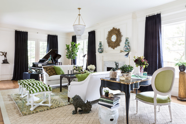
Anonymous wrote:Anonymous wrote:Anonymous wrote:Anonymous wrote:Anonymous wrote:girls, girls!
you can pick any color!
it's fine!
seriously though pull your couch away from the wall.
Oh we are tacky and have one room with two couches against opposite walls. We are just looking for livability right now with dogs and kids and don't need focal points or conversation nooks. Is there hope for us?
Yes but honestly it will look so much better if you pull them even a little off the wall. Like 6 inches. Try it.
I will try and report back
NP here -- can you tell me a little more about pulling couches away from the wall? I've lived in houses/apartments with tiny living rooms my whole life, so I always had the couch against a wall for space reasons (or lack-of-space reasons). I'm getting ready to finish a renovation now that will give me a good sized family room -- what does pulling the couches away from the walls do, visually?
I swear I'm not trying to be snarky...just sincerely trying to understand!
There is a great book called “decorating with what you have” or “use what you have” or some such. I’m jealous of your big room. Take a look at pictures of rooms you love and look up some guidelines for furniture spacing. Usually a big room looks best with several conversation areas not jammed against the wall.
The 2016 dc design house (RIP) had some good examples I thought of furniture placement in big living spaces. See how neither the couches nor the desk face a wall?
[img]https://st.hzcdn.com/simgs/b16163c2087d04d1_4-3529/home-design.jpg[img]
There are other rooms in the same house where couches against a wall totally works - but I find giant rooms where it looks like the furniture got scared of the rug and jammed back against the wall are common. It’s much nicer to travel around a seating area imo if you can swing it than in a canyon between two couches or a couch and a chair off in exile.